概述
我已经阅读了一堆“使用 CSS 垂直居中”的教程:
- http://emergentweb.com/test/valign.html
- http://blog.themeforest.net/tutorials/vertical-centering-with-css/
- http://www.jakpsatweb.cz/css/css-vertical-center-solution.html
- http://www.alistapart.com/d/footers/footer_variation1.html
- http://phrogz.net/css/vertical-align/index.html
...但是除了垂直居中之外,我的布局中还有一个组件在这些方法中都没有表示出来。
 .
.
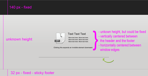
此布局有 2 个组件。首先,将页眉和页脚之间的内容垂直和水平居中(这是一个粘性页脚)。我有一个小提琴代码来演示,但我无法让它在 IE 中工作(代码在帖子的底部)。
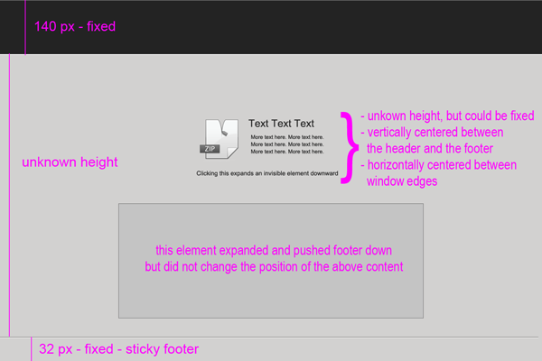
第二个组件是绿色箭头所指的位置。这表示一个隐藏元素,当单击某些文本时,该元素将垂直向下扩展。但是,我不希望此扩展将内容向上移动,就好像所有内容都居中一样...我希望此元素向下扩展而不影响内容的位置,并在扩展时将粘性页脚向下推。在大多数情况下,会出现一个浏览器滚动条。
所以隐藏元素展开的效果应该就像一面旗帜从边上掉下来。
这是隐藏元素展开后的布局:
问题
那么我将如何仅使用CSS 实现此布局并使其与跨浏览器兼容如果我需要进一步解释以澄清混淆,请告诉我。
到目前为止的代码
注意...我遗漏了HTML5 BoilerPlate附带的一些样板代码。
CSS
/* --------------------------------------------------------------------------
   General Layout
   -------------------------------------------------------------------------- */
html,body {
    height: 100%;
}

body {
    background-color: #e3e3e3;
    color: #696969;
}

#wrapper {
    min-height: 100%;
    width: 100%;
    min-width: 936px;
}

/* --------------------------------------------------------------------------
   Header
   -------------------------------------------------------------------------- */
header {
    background-color: #232323;
    height: 108px;
    width: 100%;
    margin: auto;
    padding: 24px 0px 8px 0px;
    position: relative;
}

#header-content {
    height: 100%;
    width: 800px;
    margin: auto;
    position: relative;
}

/* --------------------------------------------------------------------------
   Footer
   -------------------------------------------------------------------------- */
footer {
    background-color: #dbdbdb;
    border-top: 1px solid #bababa;
    height: 30px;
    width: 100%;
    min-width: 936px;
    margin-top: -32px;
    position: relative;
}

#footer-content {
    border-top: 1px solid #f8f8f8;
    height: 100%;
    margin: 0px auto;
    position: relative;
}

#footer-content > div {
    width: 800px;
    margin: 0px auto;
}


/* --------------------------------------------------------------------------
   DOWNLOADZONE
   -------------------------------------------------------------------------- */
#dl-info {
    width: 400px;
    margin: auto;
    display: table-cell !important;
    vertical-align: middle;
}

#show-hide {
    margin: 8px 0px;
    text-align: center;
}

/* --------------------------------------------------------------------------
   General helper classes
   -------------------------------------------------------------------------- */
.zone {
    background: none;
    border: 0px none;
    height: 100%;
    min-height: 100px;
    width: 100%;
    padding-top: 140px;
    padding-bottom: 31px;
    display: table;
    position: absolute;
    top: 0px;
    bottom: 0px;
    overflow: hidden;
}

.border {
    border: 1px solid #454545;
}

.clear {
    clear: both;
}


/* Hide from both screenreaders and browsers: h5bp.com/u */
.hidden {
    display: none !important;
    visibility: hidden;
}

/* Hide only visually, but have it available for screenreaders: h5bp.com/v */
.visuallyhidden {
    border: 0;
    clip: rect(0 0 0 0);
    height: 1px;
    margin: -1px;
    overflow: hidden;
    padding: 0;
    position: absolute;
    width: 1px;
}

/* Extends the .visuallyhidden class to allow the element to be focusable when navigated to via the keyboard: h5bp.com/p */
.visuallyhidden.focusable:active,
.visuallyhidden.focusable:focus {
    clip: auto;
    height: auto;
    margin: 0;
    overflow: visible;
    position: static;
    width: auto;
}

/* Hide visually and from screenreaders, but maintain layout */
.invisible { visibility: hidden; }

/* Contain floats: h5bp.com/q */
.clearfix:before,
.clearfix:after {
    content: "";
    display: table;
}

.clearfix:after { clear: both; }

.clearfix { *zoom: 1; }
HTML
<!doctype html>
<!-- paulirish.com/2008/conditional-stylesheets-vs-css-hacks-answer-neither/ -->
<!-- misteroneill.com/improved-internet-explorer-targeting-through-body-classes/ -->
<!--[if lt IE 7]> <html class="no-js ie ie6 lt-ie9 lt-ie8 lt-ie7" lang="en"> <![endif]-->
<!--[if IE 7]> <html class="no-js ie ie7 lt-ie9 lt-ie8 lt-ie7" lang="en"> <![endif]-->
<!--[if IE 8]> <html class="no-js ie ie8 lt-ie9 lt-ie8" lang="en"> <![endif]-->
<!--[if IE 9]> <html class="no-js ie ie9 lt-ie9" lang="en"> <![endif]-->
<!--[if (gte IE 9)|!(IE)]>
<!-->
<html class="no-js" lang="en">
<!--<![endif]-->
<head>
<title>Layout</title>
</head>
<body class="select-none">
<div id="wrapper">
<header>
<div id="header-content">
</div><!-- end #header-content -->
</header><!-- end header -->
<div id="downloadzone" class="zone clearfix">
<div id="dl-info">
<div class="border">
<div id="dl-button">Icon Here</div>
<div id="dl-extras">
<div id="dl-filename">text text text</div>
<div id="show-hide">CLICK TO SHOW/HIDE HIDDEN ELEMENT</div>
</div>
</div>
</div>
</div><!-- end #downloadzone -->
</div><!-- end #wrapper -->
<footer>
<div id="footer-content">
<div class="border-highlight">
</div><!-- end .border-highlight -->
</div><!-- end #footer-content -->
</footer><!-- end footer -->
</body>
</html>