我已经尝试了很多次,但还没有成功。
当我将鼠标悬停在此文本上时

那么它必须给我看这个盒子
如果有人可以做到这一点,我想纯粹用 CSS 来实现这个效果。
你可以这样写:
CSS
span{
    background: none repeat scroll 0 0 #F8F8F8;
    border: 5px solid #DFDFDF;
    color: #717171;
    font-size: 13px;
    height: 30px;
    letter-spacing: 1px;
    line-height: 30px;
    margin: 0 auto;
    position: relative;
    text-align: center;
    text-transform: uppercase;
    top: -80px;
    left:-30px;
    display:none;
    padding:0 20px;

}
span:after{
    content:'';
    position:absolute;
    bottom:-10px;
    width:10px;
    height:10px;
    border-bottom:5px solid #dfdfdf;
    border-right:5px solid #dfdfdf;
    background:#f8f8f8;
    left:50%;
    margin-left:-5px;
    -moz-transform:rotate(45deg);
    -webkit-transform:rotate(45deg);
    transform:rotate(45deg);
}
p{
    margin:100px;
    float:left;
    position:relative;
    cursor:pointer;
}

p:hover span{
    display:block;
}
HTML
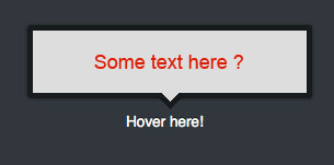
<p>Hover here<span>some text here ?</span></p>
您可以通过简单的代码轻松制作此CSS 工具提示:-
    <!DOCTYPE html>
<html>
<head>
<meta charset=utf-8 />
<title>JS Bin</title>
<!--[if IE]>
  <script src="http://html5shiv.googlecode.com/svn/trunk/html5.js"></script>
<![endif]-->
<style>
a.info{
    position:relative; /*this is the key*/
    color:#000;
    top:100px;
    left:50px;
    text-decoration:none;
    text-align:center;
  }


a.info span{display: none}

a.info:hover span{ /*the span will display just on :hover state*/
    display:block;
    position:absolute;
    top:-60px;
    width:15em;
    border:5px solid #0cf;
    background-color:#cff; color:#000;
    text-align: center;
    padding:10px;
  }

  a.info:hover span:after{ /*the span will display just on :hover state*/
    content:'';
    position:absolute;
    bottom:-11px;
    width:10px;
    height:10px;
    border-bottom:5px solid #0cf;
    border-right:5px solid #0cf;
    background:#cff;
    left:50%;
    margin-left:-5px;
    -moz-transform:rotate(45deg);
    -webkit-transform:rotate(45deg);
    transform:rotate(45deg);
  }


</style>
</head>
<body>
<a href="#" class="info">Shailender Arora <span>TOOLTIP</span></a>
  </div>
</body>
</html>
您也可以通过在display: block on hover 和display:none之间切换来实现,而不用 hover 来产生效果。
这是对其他答案的一个小调整。如果您有嵌套的 div,您可以在弹出窗口中包含更多令人兴奋的内容,例如 H1。
CSS
div.appear {
    width: 250px;
    border: #000 2px solid;
    background:#F8F8F8;
    position: relative;
    top: 5px;
    left:15px;
    display:none;
    padding: 0 20px 20px 20px;
    z-index: 1000000;
}
div.hover  {
    cursor:pointer;
    width: 5px;
}
div.hover:hover div.appear {
    display:block;
}
HTML
<div class="hover">
<img src="questionmark.png"/>
    <div class="appear">
       <h1>My popup</h1>Hitherto and whenceforth.
    </div>
</div>
这些解决方案的问题在于,当显示弹出窗口时,页面中的所有内容都会发生偏移,即页面的其余部分会向下跳转以“腾出空间”。我可以解决此问题的唯一方法是设置 position:absolute 并删除顶部和左侧的 CSS 标记。
正如他们所说,它会起作用。
在父元素中建立一个最大高度。
我以Sandeep为例并添加 max-height ,如果需要,您可以添加 max-width 属性。文本将保留在应该保留的位置(如果可能,在某些情况下,您需要更改一些值以使其保留在那里)
span{
    background: none repeat scroll 0 0 #F8F8F8;
    border: 5px solid #DFDFDF;
    color: #717171;
    font-size: 13px;
    height: 30px;
    letter-spacing: 1px;
    line-height: 30px;
    margin: 0 auto;
    position: relative;
    text-align: center;
    text-transform: uppercase;
    top: -80px;
    left:-30px;
    display:none;
    padding:0 20px;
}

span:after{
    content:'';
    position:absolute;
    bottom:-10px;
    width:10px;
    height:10px;
    border-bottom:5px solid #dfdfdf;
    border-right:5px solid #dfdfdf;
    background:#f8f8f8;
    left:50%;
    margin-left:-5px;
    -moz-transform:rotate(45deg);
    -webkit-transform:rotate(45deg);
     transform:rotate(45deg);
}

p{
    margin:100px;
    float:left;
    position:relative;
    cursor:pointer;
    max-height: 10px;
}

p:hover span{
    display:block;
}
p段中的最大高度,倒数第二个,最后一行。
在评价它无用之前对其进行测试。