10

更新 - 我决定反对 JavaScript 解决方案。确保它始终有效的唯一方法是setInterval()每隔几秒钟让它运行一次。不想那样做。我知道这个 CSS 是可能的,我已经看到它有效。如果它结束,我将重新开放赏金,以增加 150 美元。


我有一个由两部分组成的模式弹出窗口:左和右。在这两个部分中是上面的标签和下面的内容。标签固定在一定像素数,但底部区域需要能够填充剩余空间,所以我在display:table左右两侧和display: table-cell内部使用,以达到“填充剩余空间”的效果. 它在 Chrome 和 Safari 中运行良好。

这是CSS:

#tagBoxLeft,#tagBoxRight {
    display: table;
    height: 100%;
    width: 50%;
    position: absolute;
    right: 0;
    opacity: 0;
}
#tagBoxLeft { left: 0 }
#tagBoxDescription {
    display: table-row;
    -webkit-border-top-left-radius: 20px;
    width: 100%;
    word-break: break-all;
    word-wrap: break-word;
    -webkit-box-shadow: 0 1px 0 #FFF;
    -moz-box-shadow: 0 1px 0 #FFF;
    box-shadow: 0 1px 0 #FFF;
}
.nano {
    position: relative;
    width: 100%;
    height: 100%;
    overflow: hidden;
    display: table-cell;
}
#taglabel {
    display: table-row;
    z-index: 10000;
    border-top: 1px solid #FFF;
    width: 100%;
    height: 39px;
}

它只是将一堆 div 放入一个表格中,这样它们就可以具有彼此相对的高度。还要注意左右两侧是相对于浏览器窗口的,所以我不能只使用百分比。

然而,在 Firefox 和 Opera 中,#tagBoxLeft#tagBoxRight边部分拒绝接受height:100%;,而它们有display:table;. 所以它不会响应地强制底部部分向上。我知道 Firefox 和 Opera 通常支持这一点(参见http://jsfiddle.net/Qxswa/)。但是为什么我的所有内容都在 Firefox 和 Opera 中溢出?
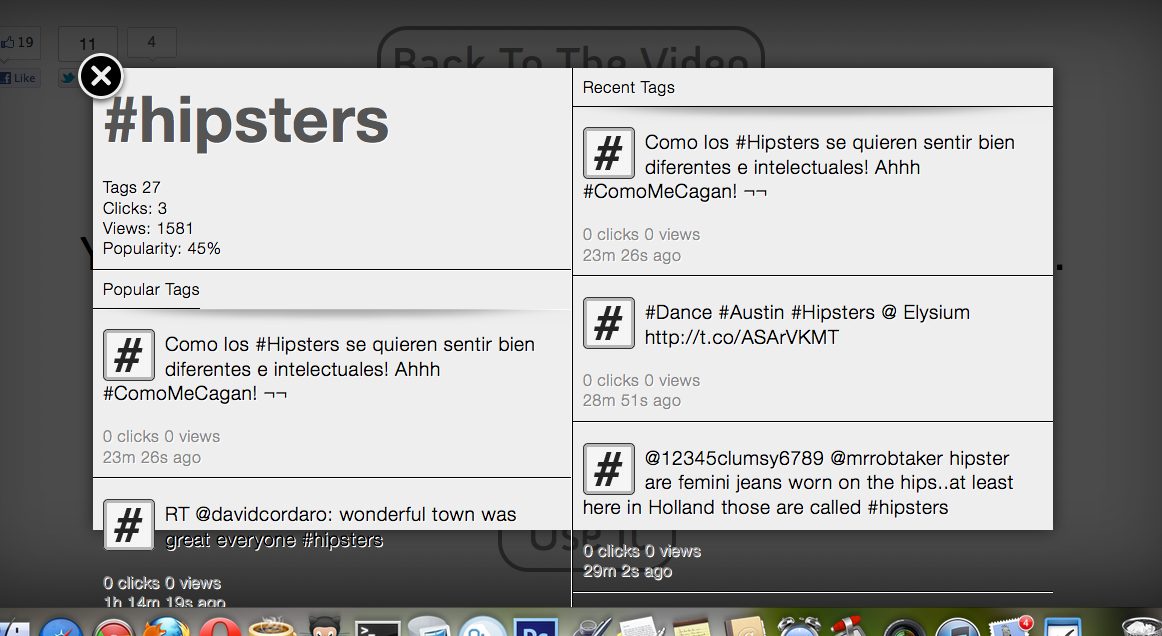
这是该问题的屏幕截图:

在此处输入图像描述

4

5 回答 5

4

为什么你不能简单地使用 JavaScript 来计算正确的高度并内联应用它是有原因的吗?它不是那么好和简单,但对于你所描述的来说这将是微不足道的。

var boxHeight = $('#tagBox').height();
var leftLabelHeight = $('#tagBoxDescription').height();
$('#tagBoxPopular').css('height', boxHeight - leftLabelHeight + 'px');

var rightLabelHeight = $('#taglabel').height();
$('#tagBoxStream').css('height', boxHeight - rightLabelHeight + 'px');
于 2012-04-25T21:39:31.207 回答
2

我在 Firefox 上打开您的网站,我看到的带有 chrome 的主题标签链接消失了。你现在正在做一些修复尝试吗?如果您将链接放回 ff 版本,我可以帮助您调试它。

更新:

我看到的是 display:table's 和 display:table-cells's 的高度过于复杂的组合,具有绝对和静态定位以及百分比高度和许多其他高度跨浏览器的易失性组合。

做了大量的修补和修复,我得到了这个:

firefox下补丁版本截图

显然仍然存在许多错误,但至少您会得到一些滚动条。

基本上,问题在于您依赖于不同浏览器似乎不太均匀呈现的百分比高度和阴暗的表格显示。

我们在这里有两个选择:

1.- 保留您原来的 css/html 方法并对 JS 滚动条进行故障排除。
2.- 选择一个简单得多的 css/html 变体

干杯

于 2012-04-25T23:00:00.503 回答
2

这是 using 和 friends 的替代方法display:table,它使用绝对定位元素经常被忽视的能力来设置它们的顶部和底部(以及左侧和右侧)值。它基本上“粘住”顶部和底部边缘,为您提供相对于容器的高度,但没有明确设置高度。

UDPATED:正如杰克逊所提到的,此代码的纯 CSS 版本没有在列中提供自动高度、固定面板。一点点 JS 就可以解决这个问题——你只需要为没有 JS 的用户设置一个合理的默认高度。JS 只需要在加载模式时运行,而不是间隔运行。

这是更新的小提琴:http: //jsfiddle.net/cxY7D/5

这是简化的 HTML:

<div id="modal">
      <div class="left">
          <div class="description">
            <h1>#tag_name</h1>
            <dl>
             <dt>Tags</dt> <dd>27</dd>
            </dl>
          </div>
          <div class="contents">
            <div class="header">            
              <h2>Featured</h2>
            </div>
            <ol>
              <li>Something Something</li>
              <li>...</li>
            </ol>
          </div>
      </div>
      <div class="right">
        <div class="contents">
          <div class="header">
            <h2>Recent</h2>
          </div>
          <ol>
            <li>Something Something</li>
            <li>...</li>
          </ol>
        </div>
      </div>
  </div>

和 CSS:

body {
      background:#444;
    }
     #modal {
       background:#FFF;
       position: absolute;
       top: 4em;
       bottom: 4em;
       left: 6em;
       right: 6em;
     }

     #modal .left,
     #modal .right {
       position:absolute;
       top: 0;
       bottom: 0;
     }

     #modal .left {
       background:#ACF9E4;
       left: 0;
       right:50%;
     }

     #modal .right {
       background:#FCFFCD;
       right: 0;
       left:50%;
     }

     #modal .contents {
      position:absolute;
      top: 0;
      bottom: 0;
      width: 100%;
      overflow-y:auto;
     }

     #modal .description {
       height: 8em;
     }

     #modal .description + .contents {
       top: 10em;
   }

     #modal .header,
     #modal .description,
     .contents li {
       border-bottom:1px solid #CCC;
       padding: 1em;
     }

     #modal .description dt {
       float: left;
       padding-right: 1em;
     }

这是一种非常有用且强大的技术。一提到“绝对位置”,很多人都会不寒而栗,但这样使用,真的很解放!

JS(假设 jQuery)

$(function(){
    $('#modal').on('display', function(){
        //Calculate the height of the top left panel, and provide the remaining space to the bottom left
        var leftColumn = $(this).find('.left'),
            descriptionHeight = leftColumn.find('.description').height('auto').outerHeight(); //Set the height to auto, then read it

        leftColumn.find('.contents').css('top', descriptionHeight)//Apply the height to the scrolling contents pane     
    });

    $('#modal').trigger('display');
});​

JS 将左上窗格重置为自动高度,然后读取高度并将其应用为左下窗格的顶部坐标。它作为自定义事件应用,因此您可以将其作为模式显示代码的一部分来触发。

这是我使用类似技术给出的答案,以及更多关于如何和为什么的解释:不可能的布局?. 查看A list Apart文章以获得更多讨论,以及一些使其在 IE6 中工作的简单修复(如果您关心的话)。

于 2012-05-01T22:04:33.113 回答
0

你可能想看看你是如何使用<section>. 它与<div>.

W3C - 使用 HTML5 部分元素和标题元素。

<header>看起来一样。它们都是流元素,不是作为内容容器设计的,而是作为内容容器的语义结构元素。

我使用了 Firebug,并凭直觉将两者都<header>更改了<section>display:block事情开始成形;但是,在这些更改之后,我无法触发滚动效果。<header>然后我在 safari 中更改为display:inline. 果然 - 我的两个浏览器窗口都是这样的: 在此处输入图像描述

于 2012-04-25T08:18:12.760 回答
0

您需要隐藏#tagboxleftand#tagboxright的溢出。这可以通过设置#tagbox为来完成overflow:hidden,但是这将隐藏关闭按钮的一部分。所以你需要另一个 div 围绕左右而不是 x 和overflow:hidden.

像这样:

<div id="tagbox">
    <div id="tagboxX"></div>
    <div id="tagboxleftright" style="overflow:hidden"> <!-- This is the wrapper div around tagbox left & right. Of course, move overflow:hidden to the style sheet -->
        <div id="tagboxLeft"></div>
        <div id="tagboxRight"></div>
    </div>
</div>

这适用于 Firefox,它应该适用于 Internet Explorer。

于 2012-04-25T19:36:51.147 回答