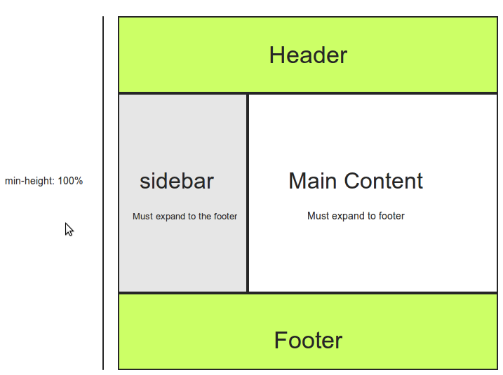
我已经看到了许多类似的问题,但还没有找到我正在寻找的答案。进一步的信息如下:
16428 次
5 回答
2
通过 css 可能是可能的,但需要一些技巧。
您需要通过添加一个 padding-bottom: 1000px 使两个 div/列都非常高,然后使用 margin-bottom: -1000px “欺骗浏览器”认为它们不是那么高。通过下面的示例可以更好地解释。
http://jsfiddle.net/mediasoftpro/Ee7RS/
希望这会没事。
于 2012-04-20T03:12:24.007 回答
1
你可以试试display:table; 到父 div并显示:table-cell;到Child Div来实现你的结果....
查看代码:-
<!DOCTYPE html>
<html>
<head>
<meta charset=utf-8 />
<title>JS Bin</title>
<!--[if IE]>
  <script src="http://html5shiv.googlecode.com/svn/trunk/html5.js"></script>
<![endif]-->
<style>
  .container {
    background:red;
    width:600px;
    display:table;
  }

  .left {
    background:yellow;
    width:200px;
    display:table-cell;

  }


    .mid {
    background:blue;
    width:400px;
    display:table-cell;


  }

      .right {
    background:green;
    width:200px;
    display:table-cell;

  }


</style>
</head>
<body>
  <div class="container">
    <div class="left">shailender</div>
      <div class="mid">Pellentesque habitant morbi tristique senectus et netus et malesuada fames ac turpis egestas. Vestibulum tortor quam, feugiat vitae, ultricies eget, tempor sit amet, ante. Donec eu libero sit amet quam egestas semper. Aenean ultricies mi vitae est. Mauris placerat eleifend leo.
        fff</div>
      <div class="right">afdafaf</div>


  </div>
</body>
</html>
于 2012-04-20T07:06:34.803 回答
0
嘿,我想你想要这个
CSS
**
.wraper, .header, .footer{
width:80%;
    margin:0 auto;
    overflow:hidden;
    border:solid 2px red;
}
.header{
    height:100px;
    background:green;
    border-color:darkred;
}
.sidebar{
width:20%;
    background:yellow;
    float:left;
}
.content{
width:70%;
    background:pink;
    float:right;
}
.footer{
    height:100px;
    background:blue;
    border-color:black;
}
#container2 {
background: none repeat scroll 0 0 #FFA7A7;
clear: left;
float: left;
overflow: hidden;
width: 100%;
}
#container1 {
background: none repeat scroll 0 0 #FFF689;
float: left;
position: relative;
right: 75%;
width: 100%;
}
#sidebar {
float: left;
left:76%;
overflow: hidden;
position: relative;
width: 20%;
text-align: justify;
}
#content {
    float: left;
    left: 81%;
    overflow: hidden;
    position: relative;
    text-align: justify;
    width: 72%;
}
** HTML
    <div class="header">header bar </div>
    <div class="wraper">
        <div id="container2">
    <div id="container1">
        <div id="sidebar">
            This is dummy text here This is dummy text here This is dummy text here This is dummy text here This is dummy text here This is dummy text here This is dummy text
        </div>
        <div id="content">
           This is dummy text here This is dummy text here This is dummy
        </div>
    </div>
</div>
    </div>
        <div class="footer">Footer bar</div>
现场演示http://jsfiddle.net/rohitazad/Pgy75/2/
有关此的更多信息,请单击此处 http://matthewjamestaylor.com/blog/equal-height-columns-2-column.htm
于 2012-04-20T05:07:59.210 回答
0
唯一真正的答案:
<!DOCTYPE HTML PUBLIC "-//W3C//DTD HTML 3.2 Final//EN">
<table border="1" height="100%" width="100%">
    <tr>
        <td width="10%">
            left
        </td>
        <td>
            right
        </td>
    </tr>
</table>
于 2014-08-13T15:30:28.417 回答