<div id="main" style="height: 100%">
    <div id="content">
    </div>
    <div id="toolbar" style="height: 50px">
    </div>
</div>
因此,maindiv 已调整大小,toolbar应具有固定高度,并且content' 的高度应为 = height of main- 50px。仅使用样式(不使用 JavaScript)怎么可能做到这一点?
什么乱七八糟的吧?不用担心,您的问题过去和现在仍然有效。让我们专注于回答这个问题。
我冒昧地做了三个例子1:
让我们看看我是否可以正确解释它们。
1遗憾的是,我无法根据新的 CSS3 属性调整它们的大小resize。
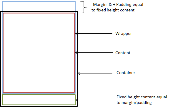
所以,我使用了一种旧技术,你基本上使用 100% 高度的包装器,然后给它一个负边距和一个对应于恒定高度值的正填充。负边距和正内边距的组合将导致与具有固定高度的内容具有相同高度的空白空间。
.container{
    height: 400px;
}

.wrapper{
    height: 100%;
    margin-top: -50px;
    padding-top: 50px;
}

.content{
    height: 100%;
}

.fixed_content{
    height: 50px;
}
从技术上讲,固定内容正在从包装器中“推出”,但由于包装器具有针对该元素进行调整的负边距,因此看起来像正常流程。
为了更好地展示,我画了这张图。
应该注意的是,您也可以在水平方向上做同样的事情,只需进行一些细微的调整。
.container{
    width: 400px;
    height: 400px;
}

.wrapper{
    height: 100%;
    width: 100%;
    padding-left: 50px;
    margin-left: -50px;
    white-space:nowrap;
}

.content{
    height: 100%;
    width: 100%;
    display: inline-block;
}

.fixed_content{
    height: 100%;
    width: 50px;
    display: inline-block;
}
原则上,它的工作方式相同。主要区别在于您必须“强制”内联元素保持在同一行,以便溢出改为水平对齐。我通过使用white-space: no-wrap;和display: inline-block;
这是我画的一张图片,展示了水平等价物。

可能性是无止境!只要您知道所有固定元素高度/宽度的总和,就可以向其中添加更多元素。
表格布局是为懦夫准备的。所有优秀的程序员都使用divs。;)
HTML
<div class='container'>
    <div class='node_1'>
        <div class='wrapper'>
            <div class='node_1_1'>
                <div class='wrapper_2'>
                    <div class='node_1_1_1'></div>
                    <div class='node_1_1_2'></div>
                </div>
            </div>
            <div class='node_1_2'></div>
        </div>
    </div>
</div>
CSS
div{
   -moz-box-sizing: border-box;
    -webkit-box-sizing: border-box;
    box-sizing: border-box;
    padding: 2px;
}

.container{
    border: 2px solid red;
    width: 400px;
    height: 400px;
    margin: 0 auto;
}

.node_1{
    border: 2px solid gray;
    height: 100%;
}

.wrapper{
    padding: 52px 0 0 0;
    margin-top: -52px;
    height: 100%;
}

.node_1_1{
    border: 2px solid purple;
    height: 100%;
}

.node_1_2{
    height: 50px;
    border: 2px solid #b80808;
    margin-top: 2px;
}

.wrapper_2{
    padding: 152px 0 0 0;
    margin-top: -152px;
    height: 100%;
}

.node_1_1_1{
    border: 2px solid green;
    height: 150px;
}

.node_1_1_2{
    border: 2px solid orange;
    height: 100%;
    margin-top: 2px;
}
HTML
<div class='container'>
    <div class='wrapper'>
        <div id="content"></div>
        <div id="toolbar"></div>
    </div>
</div>
CSS
div{
    -moz-box-sizing: border-box;
    -webkit-box-sizing: border-box;
    box-sizing: border-box;
    padding: 2px;
}

.container{
    border: 2px solid red;
    width: 400px;
    height: 400px;
    margin: 0 auto;
}

.wrapper{
    height: 100%;
    padding: 52px 0 0 0;
    margin-top: -52px;
}

#content{
    height: 100%;
    border: 2px solid green;
}

#toolbar{
    height: 50px;
    border: 2px solid orange;
    margin-top: 2px;
}
HTML
<div class='container'>
    <div class='wrapper'>
        <div id="content"></div>
        <div id="vert-toolbar"></div>
    </div>
</div>
CSS
div{
    -moz-box-sizing: border-box;
    -webkit-box-sizing: border-box;
    box-sizing: border-box;
    padding: 2px;
}

.container{
    border: 2px solid red;
    width: 400px;
    height: 400px;
    margin: 0 auto;
}

.wrapper{
    height: 100%;
    width: 100%;
    padding: 0 52px 0 0;
    margin: 0 -52px 0 0;
    white-space:nowrap; /*Force elements to stay on horizontal plane*/
}

#content{
    height: 100%;
    width: 100%;
    border: 2px solid green;
    display: inline-block;
}

#vert-toolbar{
    height: 100%;
    width: 50px;
    border: 2px solid blue;
    display: inline-block;
    margin-left: -2px; /*For the borders (2+2 = 4, -2 for a 2px "padding"*/

}