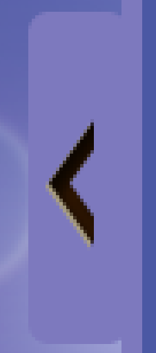
如何在css3中创建箭头?像这样。

jsfiddle http://jsfiddle.net/BdSP4/1/
HTML
<div class="angle"></div>
CSS
.angle:after { /* Thanks to :after just one div is necessary */
    content: '.';
    border-top: 20px solid #000; /* NW triangle gap */
    border-bottom: 20px solid #000; /* SW triangle gap */
    border-left: none;
    border-right: 20px solid transparent; /* W triangle */
    position: relative;
    left: 20px;
}
.angle {
    font-size: 0px; line-height: 0%; width: 0px; /* Necessary to not screw up the layout */
    border-top: 20px solid transparent; /* NE triangle gap */
    border-bottom: 20px solid transparent; /* SE triangle gap */
    border-left: none;
    border-right: 20px solid #000; /* E triangle */
}
更新:小版本
这是 2 个重叠的三角形。一个是黑色的,一个是白色的。
相同的 HTML,不同的 CSS
.angle:after {
    content: '.';
    border-top: 10px solid transparent;
    border-bottom: 10px solid transparent;
    border-left: none;
    border-right: 10px solid white;
    position: relative;
    left: 5px;
}
.angle {
    font-size: 0px; line-height: 0%; width: 0px; /* Necessary to not screw up the layout */
    border-top: 10px solid transparent;
    border-bottom: 10px solid transparent;
    border-left: none;
    border-right: 10px solid #000;
}
<div class="triangle-left">
<div></div>
</div>
.triangle-left {
border-color: transparent black transparent transparent;
border-style: solid;
border-width: 20px;
width: 0;
height: 0;
}
.triangle-left div
{
border-color: transparent white transparent transparent;
border-style: solid;
border-width: 10px;
width: 0;
height: 0;
position:relative;
top:-9px;
left:0px;
}
这是一个内部有一个白色三角形的三角形,看起来像一个箭头。有关 CSS3 三角形的更多信息,请参见此处:
您不必使用 CSS 3 - 使用 HTML 实体创建它:
<span>‹</span>
只需使用 CSS3 添加替代方案 rotate
CSS
.arrow { width: 20px; height: 20px; overflow: hidden; }
.arrow span  {
    display: block;
    border: 4px #000 solid;
    background: #fff;
    width: 14px;
    height: 14px;
    float:right;
    margin-right: -12px;

    -webkit-transform: rotate(45deg);
    -moz-transform: rotate(45deg);
    -ms-transform: rotate(45deg);
    -o-transform: rotate(45deg);
    transform: rotate(45deg);
    filter: progid:DXImageTransform.Microsoft.Matrix(
         M11=0.7071067811865476, M12=-0.7071067811865475, M21=0.7071067811865475, M22=0.7071067811865476, sizingMethod='auto expand');
    zoom: 1;
}
HTML
<div class="arrow"><span></span></div>